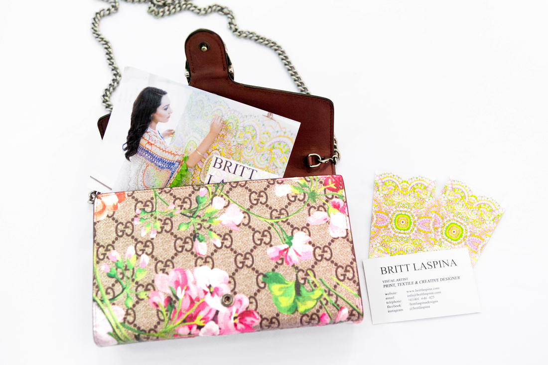
 Over the last 10 years, social media has changed, and those of us who grew up online, are changing the way we use it too. In my early twenties, I was one of the first adopters to the platform, while growing up from a teenager to a young adult - I slowly worked away on building my account to have over 10,000 followers. I would share my print designs and a lot of my personal life: trips, meals, outfits, major life updates, all of the things most users are doing today.
Overall, I would post a mix of personal and business content, people got to see the best of both worlds, and as much as I loved the attention the design content was getting - the design business was suffering, and in a sense, so was my privacy. Before expecting my first child, I knew what I had to do. My values had changed, I no longer wanted to use social media this way. I knew it was time to do a data cleanse, a follower 'clean up'. Over the course of the next few months, I removed thousands of followers on the personal account, switched it to private, and made a fresh page for my design business, titled @bybrittlaspina. I knew in order to go 'all in' for my business, I had to create a new public account, exclusively dedicated to design. I am pleased to report that just in these two short years, it has grown to nearly 3,000 followers, all of whom are industry and niche specific. I've reached over 100k accounts and amassed thousands of likes and saves. It is growing fast for the amount I post, my business has never been busier, and I've never been happier. Below, I'll share 5 key benefits I've experienced from starting a new page from scratch, focusing on delivering consistent, relevant value to my audience.
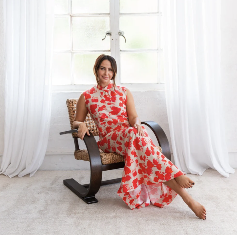
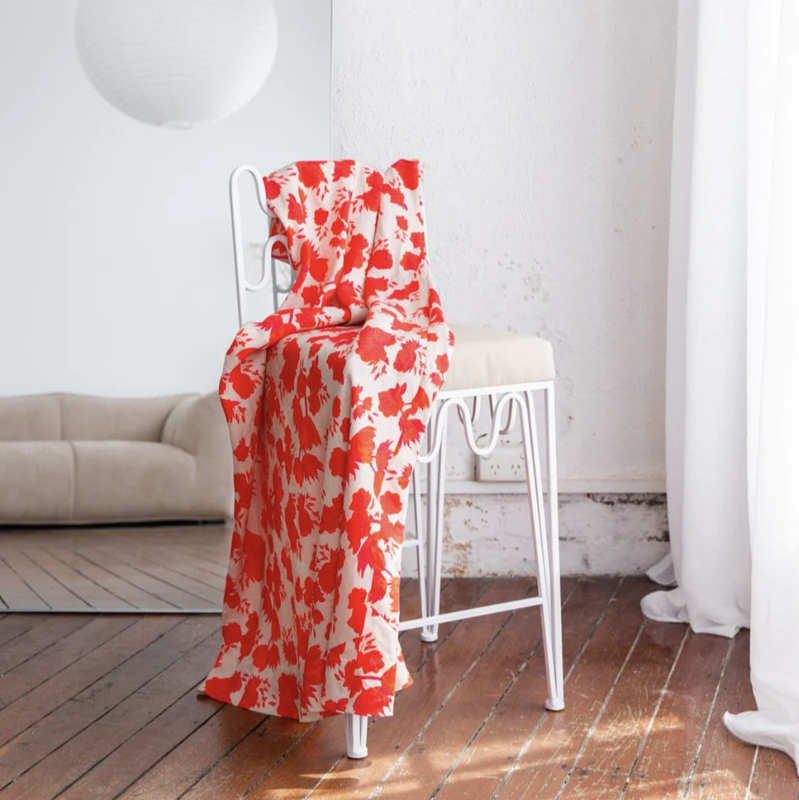
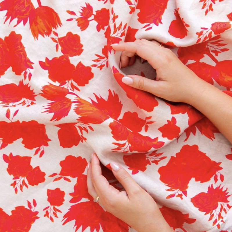
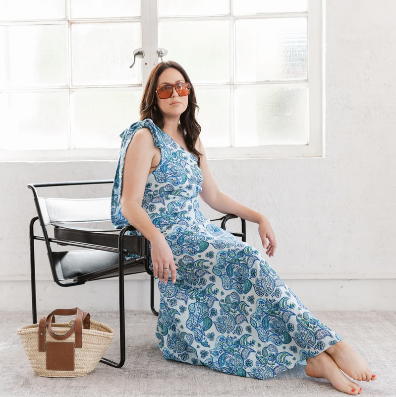
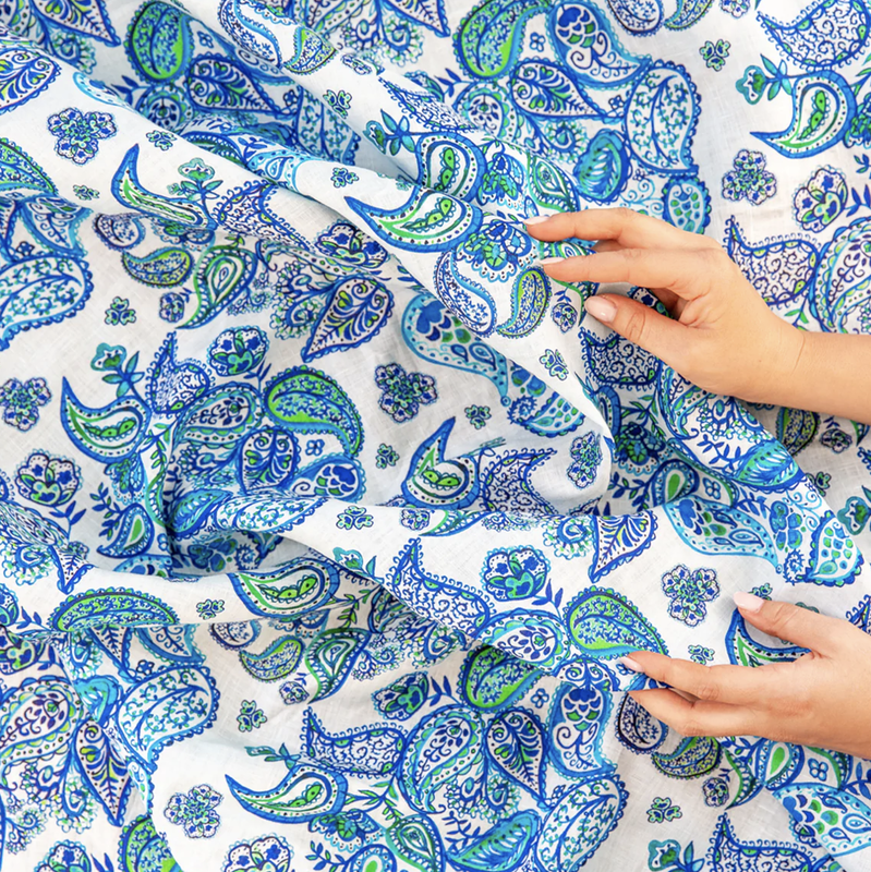
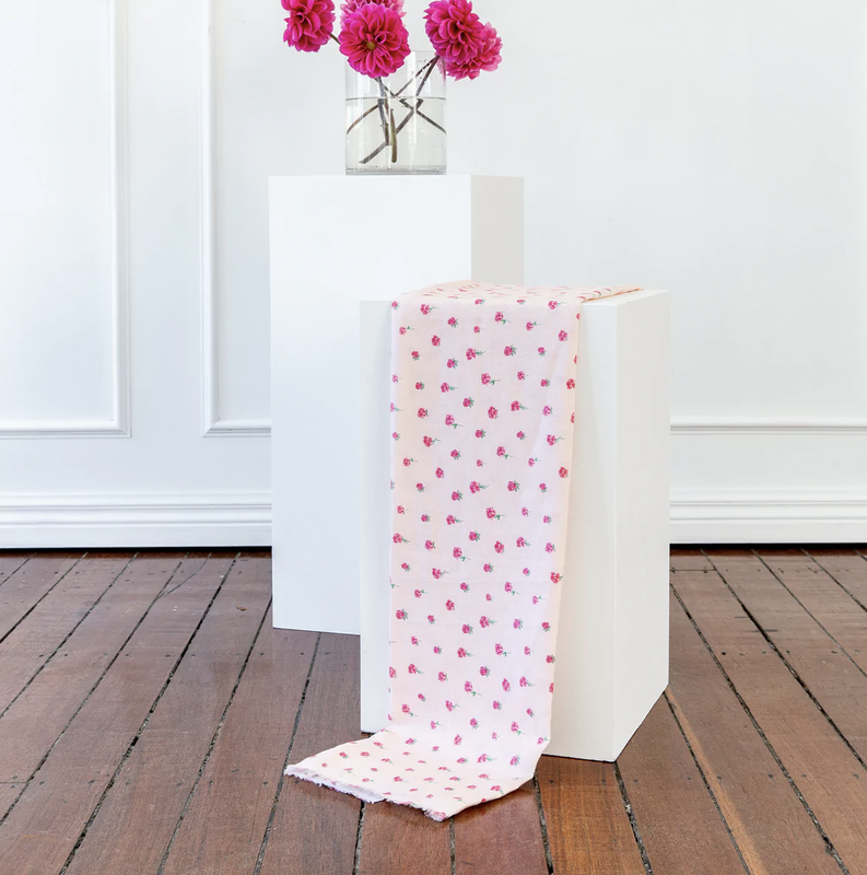
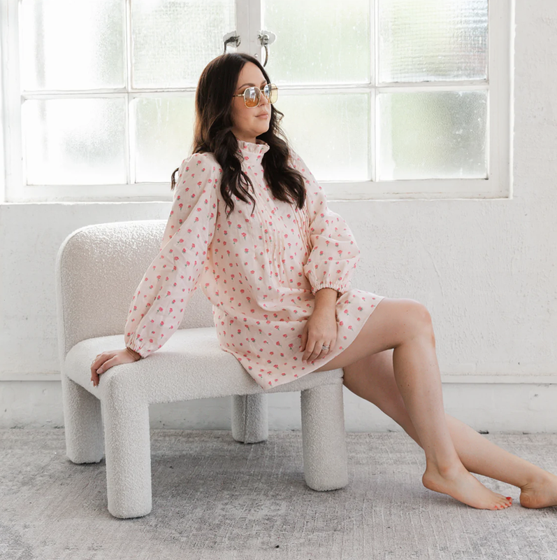
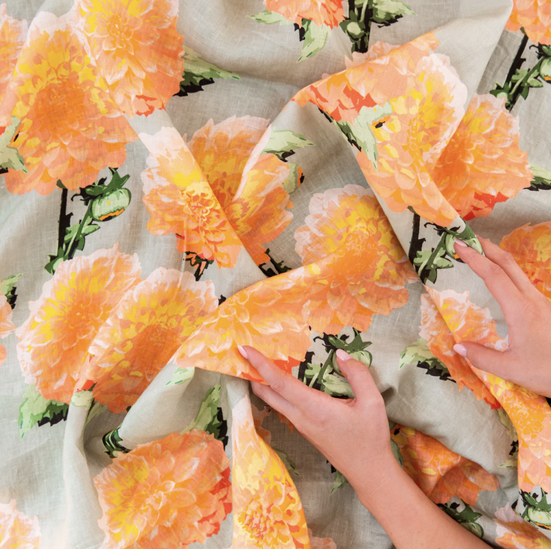
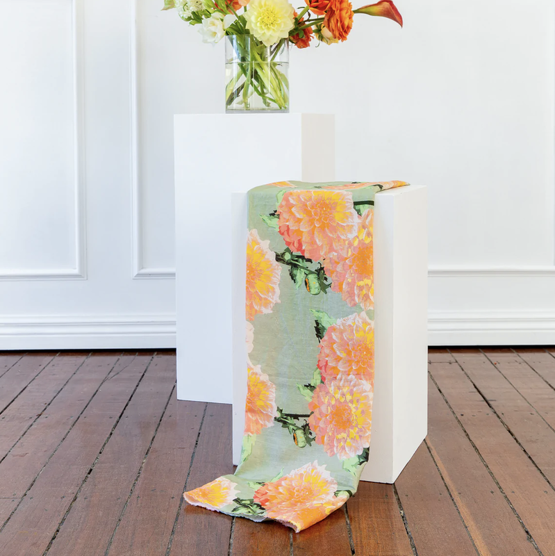
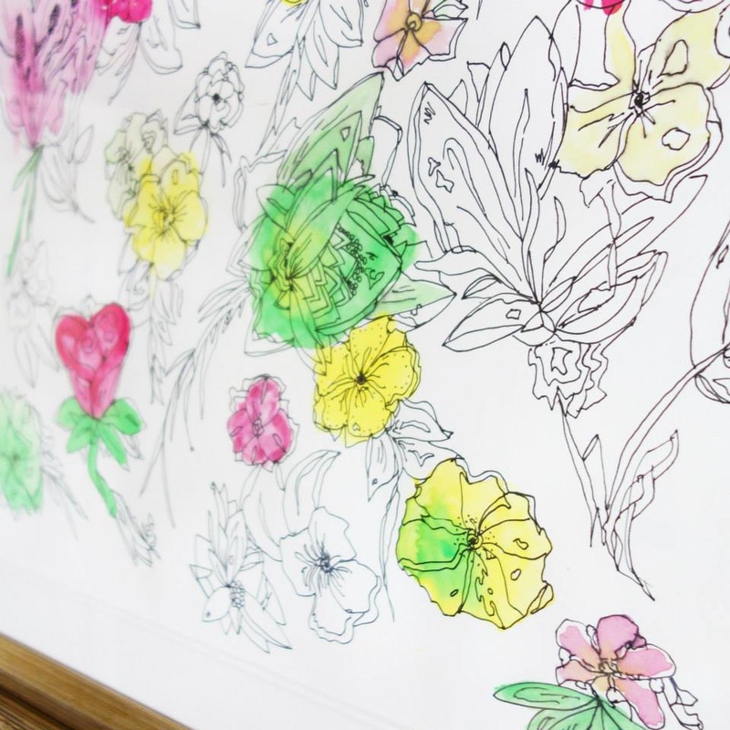
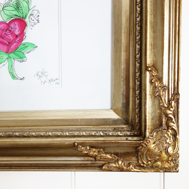
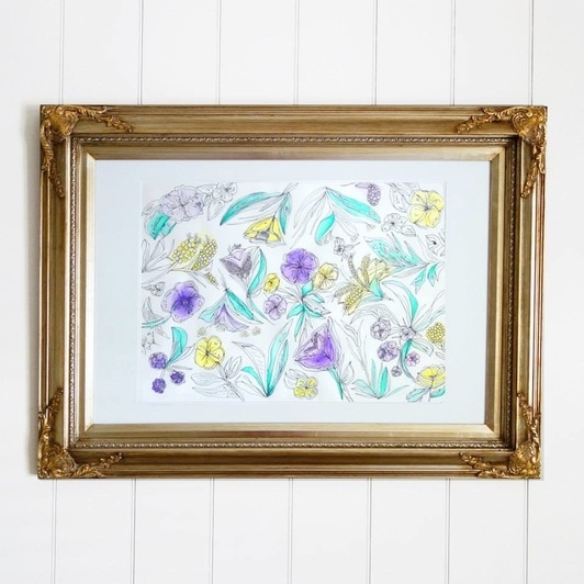
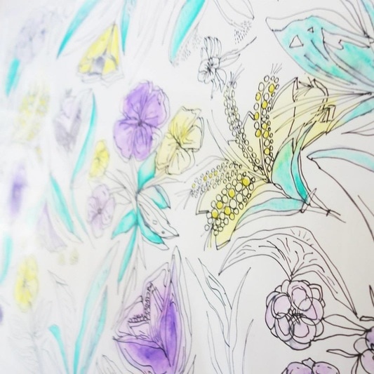
In conclusion, while it was daunting to start from scratch and create a separate account for my business, it was a strategic move that has benefited me in many ways. I have never been busier, and while I have less followers or "vanity metrics" at the moment, the followers I do have are the right ones! The decision has allowed me to maintain professionalism, focus on a relevant content strategy, build credibility, and engage with my audience effectively. By focusing on my new business page @bybrittlaspina, I can also aim to set clear boundaries, protect my daughter while still growing online, and maintain professionalism. Ultimately, a dedicated business account has provided the ideal platform for delivering consistent, relevant value to my audience. So, if you're wanting to enhance your personal brand or business's online presence, consider making the move to a dedicated account for your professional endeavors. BRITT LASPINA x THE FABRIC BROKER It brings me joy to see designs I have created, that come so naturally to me, light up the lives of so many. So when The Fabric Broker (TFB), a business selling fabric by the metre to the public, contacted me to see if I would design prints for their new range, I was delighted to accept. Their vision for the prints commissioned are mostly bold, bright and daring. That is one of the many reasons why I was so excited to accept this project. So many brands won't invest money in crazy patterns, because the more out there they are, the more risk there is. Each print designed for TFB is FUN for both the customer who decides to purchase fabric to create their next piece and also for me to create! It is safe to say that working on this project has kept me busy, the fact TFB kept coming back for prints is a testament to their happiness and positive experience working with me. Which is the best feeling of all. Below I will step you through each print and explain the process behind them! Unlike other designs sold by the brand, every print I designed for TFB Sold Out. BIG RED This print was created entirely digitally, on adobe illustrator. I hand drew each motifs, ensuring there would be enough depth to add a few tonal shades. The vision of the print was to create a hand blocked look, not knowing where the design started and ended. This is the beauty of a seamless repeat! I chose a medium shade of oatmeal for the background colour after looking through my Pantone books. The people LOVED this print.. You can see some of the comments here, alongside nearly 4k organic reach likes. POPPING PAISLEY As you might be able to tell, this print was hand painted with watercolours. I assembled the motifs in Adobe Photoshop, filling in each paisley cluster with little motifs to embrace the negative space. TFB sent me plain navy paisley inspiration, though I wanted to give this print a real watercolour feature, so I mixed in some bright greens to really make it pop! You can watch the process reel here! COMING UP ROSES This is such a classic and soft print and was a joy to create. I hand painted each floral motif with watercolours and assembled in Adobe Photoshop, ensuring the scale of each motif was evenly distributed. To finish, I selected the perfect soft pink from my Pantone books! DELILAH This print is unlike anything I have ever designed before... from the colours to the concept. It is really unusual and I just love it. I designed this single, highly detailed motif on Adobe Illustrator. What makes it so great and life like is the way I have shaded the petals, ensuring they deliver that dimensional appeal while still being able to be screen printed if needed. You can view the process reel here. Stay tuned. There are three more prints to come soon...
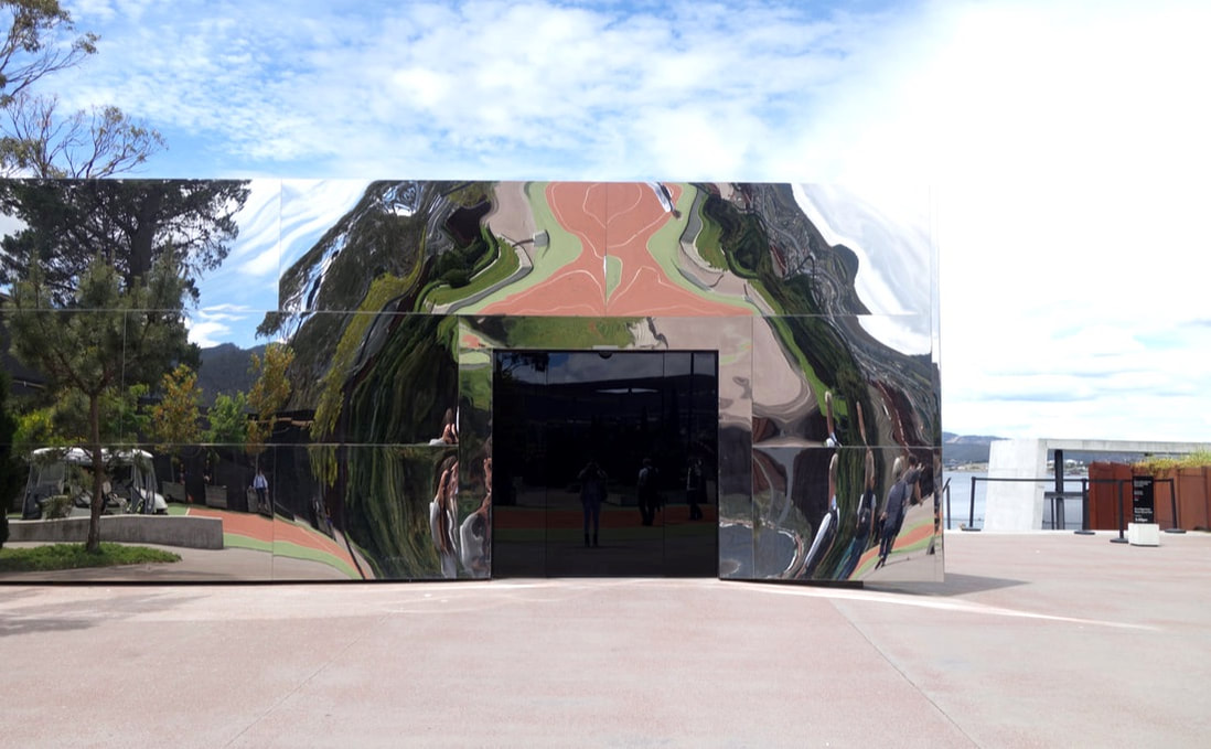 
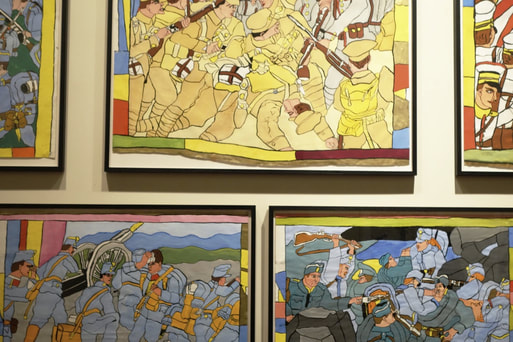
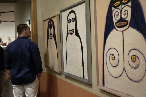
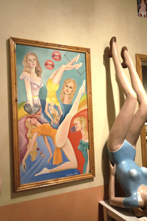
There is no denying that my time at MONA (Museum of Old & New Art) elected an untouched state of mind deep within me. The music and lighting all contributed to what was and certainly felt like an intense moody environment. At times a little creepy, although for the most part, the perfect setting for reflection and deep thought. The art was of course subjective, evoked emotion and reaction, arguably the very thing that art is meant to do.
My day at MONA made me appreciate the vast amount of differences that lie between Artists, the little details, the colour palettes, the minimalism. Have you been to MONA? What did you think? Britt xx 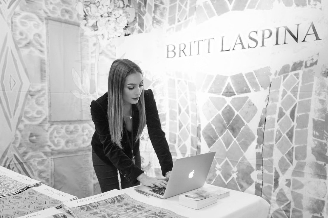  
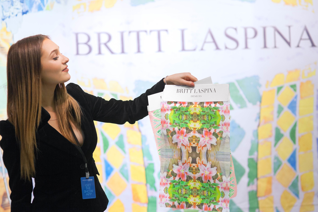
I was so thrilled to have exhibited in New York City at the leading Trend Forecasting Event in the world, Premiere Vision. To have my studio be a part of such a large industry event was a huge goal of mine and it feels so amazing to have been a part of the Spring Summer Trends in Fashion for 2017. The Britt Laspina Studio exhibited a number of prints that fell under different collections, including a Floral, Tribal, Oriental, Monochrome and Watercolour Blues Collection. This collection is still open for preview under the Print Design section on the website, login details can be granted upon request. Safe to say the show was a success and I'm so excited to have some amazing new clients based in New York, Boston, Cape Cod and The Hamptons. I also had the pleasure of being interviewed by New York writer, Natalie Zfat for Apparel News, California.
It would be poor taste to list all of the incredible people that I met, but something that will make my local Australian readers laugh is Peter Alexander decided to approach and introduce himself to me. After hearing my accent he immediately asked if I was from Sydney or Melbourne, much to his shock I answered " Ahh.. Brisbane actually!" Yes Peter, you heard me! The look on his face still makes me laugh, if Miranda Kerr and the G20 can't put Brisbane on the map than maybe I might have to keep trying..
Thanks for reading. Love Britt xx
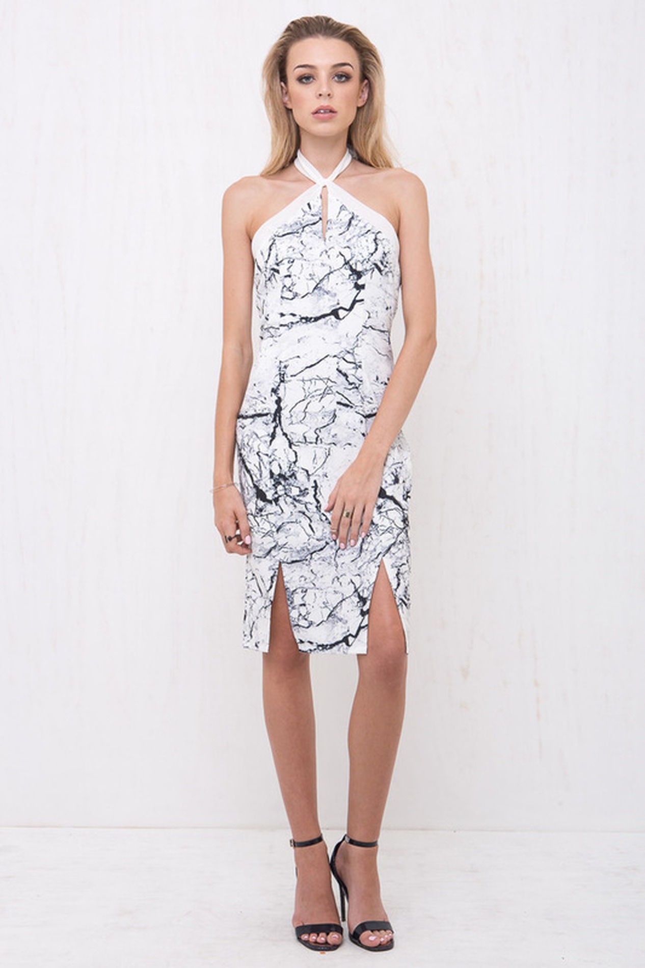
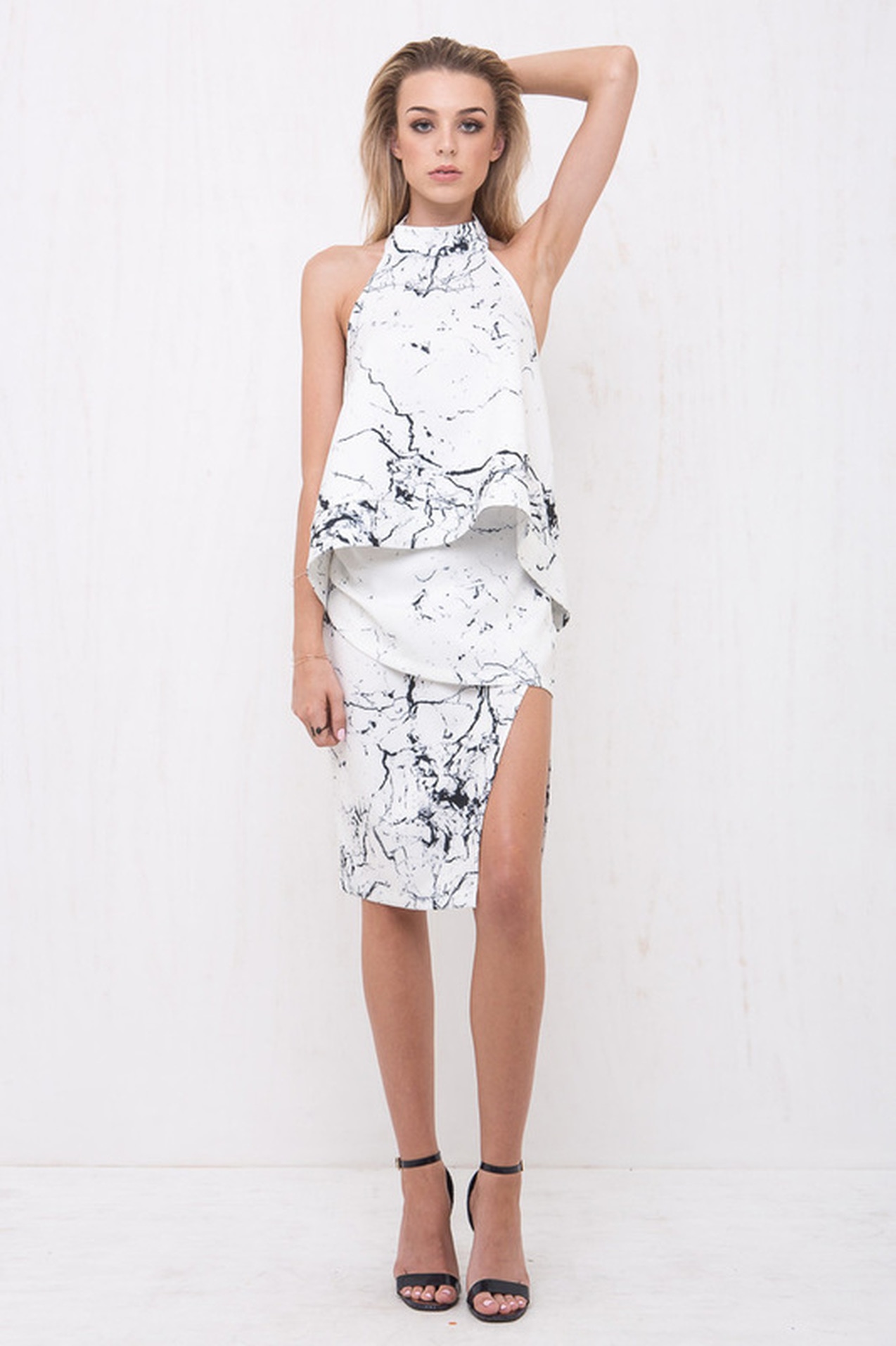
 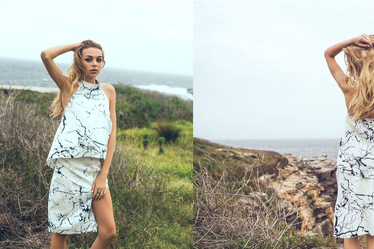 I recently collaborated with Australian Label Morrisday to design a custom Marble print for them. As many of you may know or even assume, this print isn't something I would traditionally design.
With that being said, I love this collaboration for so many reasons. Along with it being a nice change, I really do enjoy designing simple monochrome prints. I feel this collaboration also represents my diversity and willingness to deliver my full potential to a client and their personal brief. While most times I will not design something if it is not true to myself, I do pride myself on always trying to ensure I deliver content that is as close to my clients vision as possible. This Marble print can now be purchased from Morrisday via their online store, or locally via one of their Stockists such as Princess Polly, Verge Girl, Mishkah, Coco Bella or Hazel Mai Boutique. Britt xx
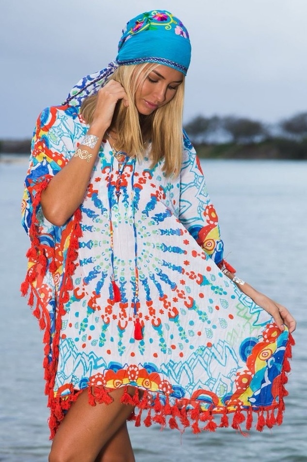
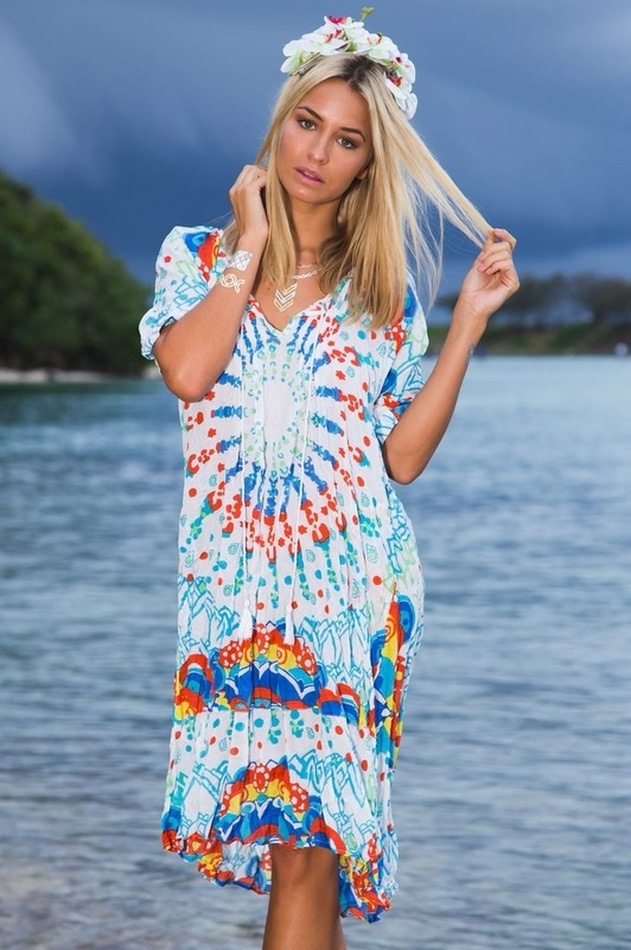
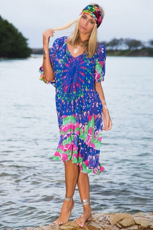
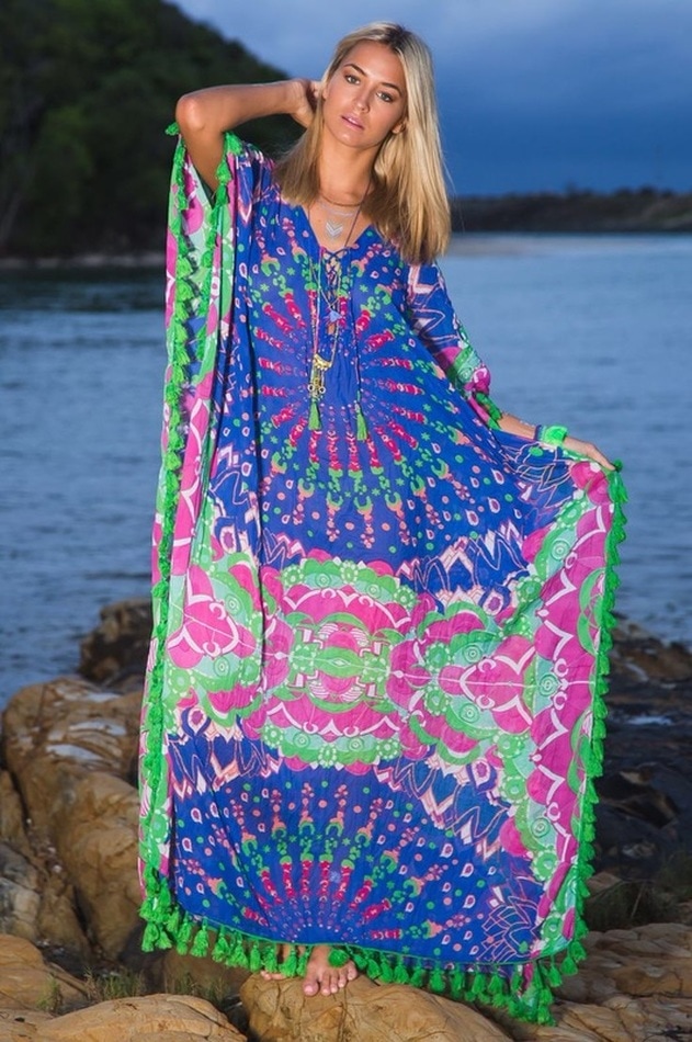
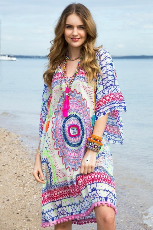
 I always love my print collaborations with Ruby Yaya Fashion. If I do say so myself, I think they captivate the eyes of many. Owner Melissa, has such a creative eye and knows just what to do with my colourful prints when they come her way. This particular print, is a unique Mandala with a spotty modern twist.
Aussie model Madi Edwards rocks this print that comes in two colour ways and is featured on three different styles of frocks. Keep your eyes peeled for this fun loving print in a fab boutique near you, Ruby Yaya is popping up everywhere!
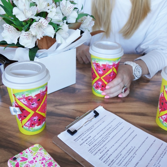
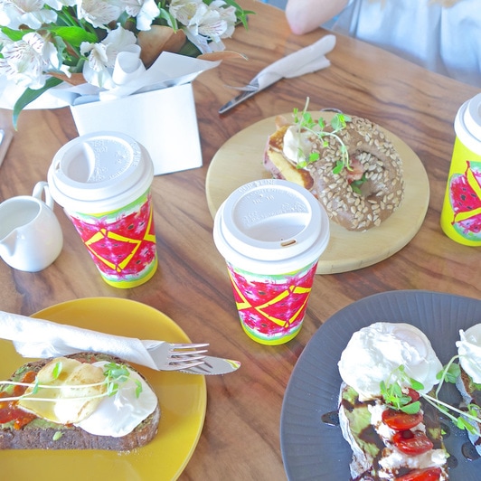
Love Britt xx 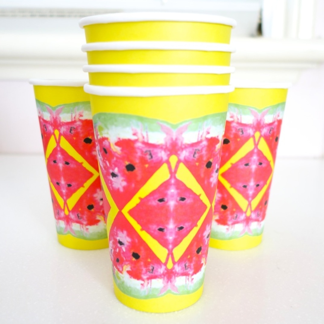 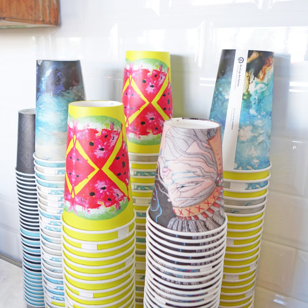 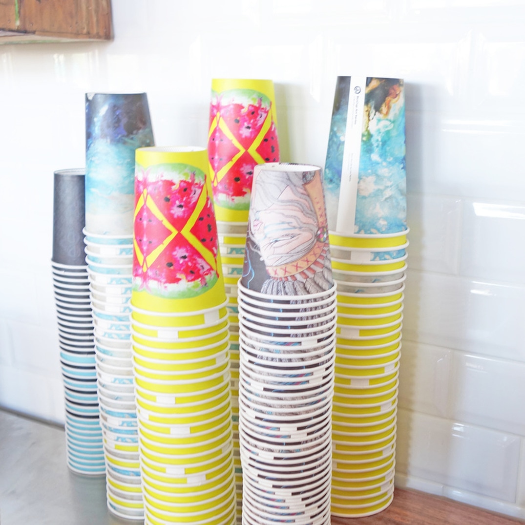 I had the pleasure of being featured in Bio Paks current Artist Print Series, artwork from Australian and New Zealand artists printed on their 8oz, 12oz and 16oz single wall and double wall BioCups. A great opportunity for me, as my design has now been printed on a quarter of a million cups worldwide! 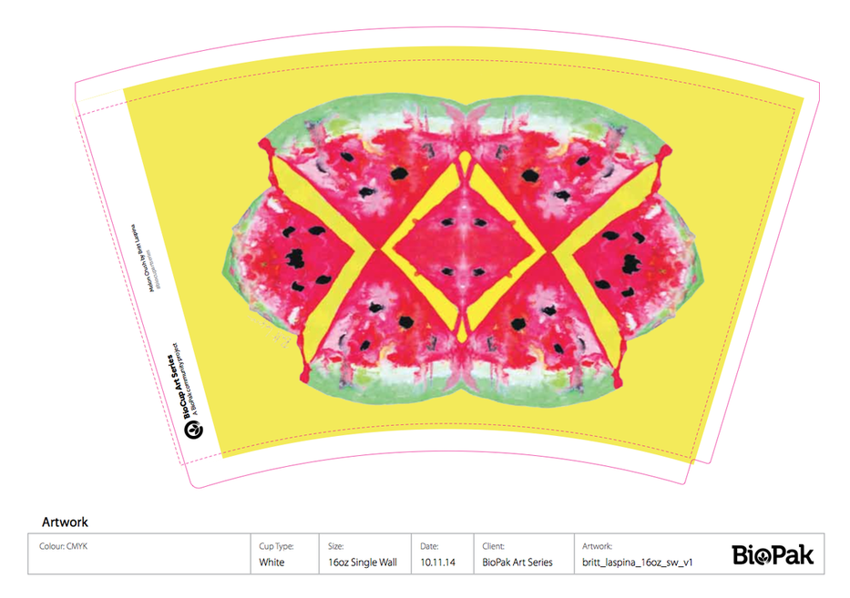 My Print, "Melon Crush" is a hand painted watercolour design. It embodies all things summer, from fresh juicy fruits, to bright neon hues and healthy living. It’s carefree brush strokes and watercolour blends symbolise the watermelons natural place in our environment, earth and soil. The artworks mirror effect represent my eye for symmetry, pattern and style, making this fruity piece unique, eye catching and memorable.
Photos with the cups are trending on Instagram under the hash tag #BioCupPrintSeries - and that is exactly where I found Cafe Dezire, a local coffee shop that is a proud supporter and stockist of Bio Cup. Of course, I had to go and check it out. I was pleasantly surprised with the food and level of service that they had. It was such a cool experience getting to drink out of my own cup design!
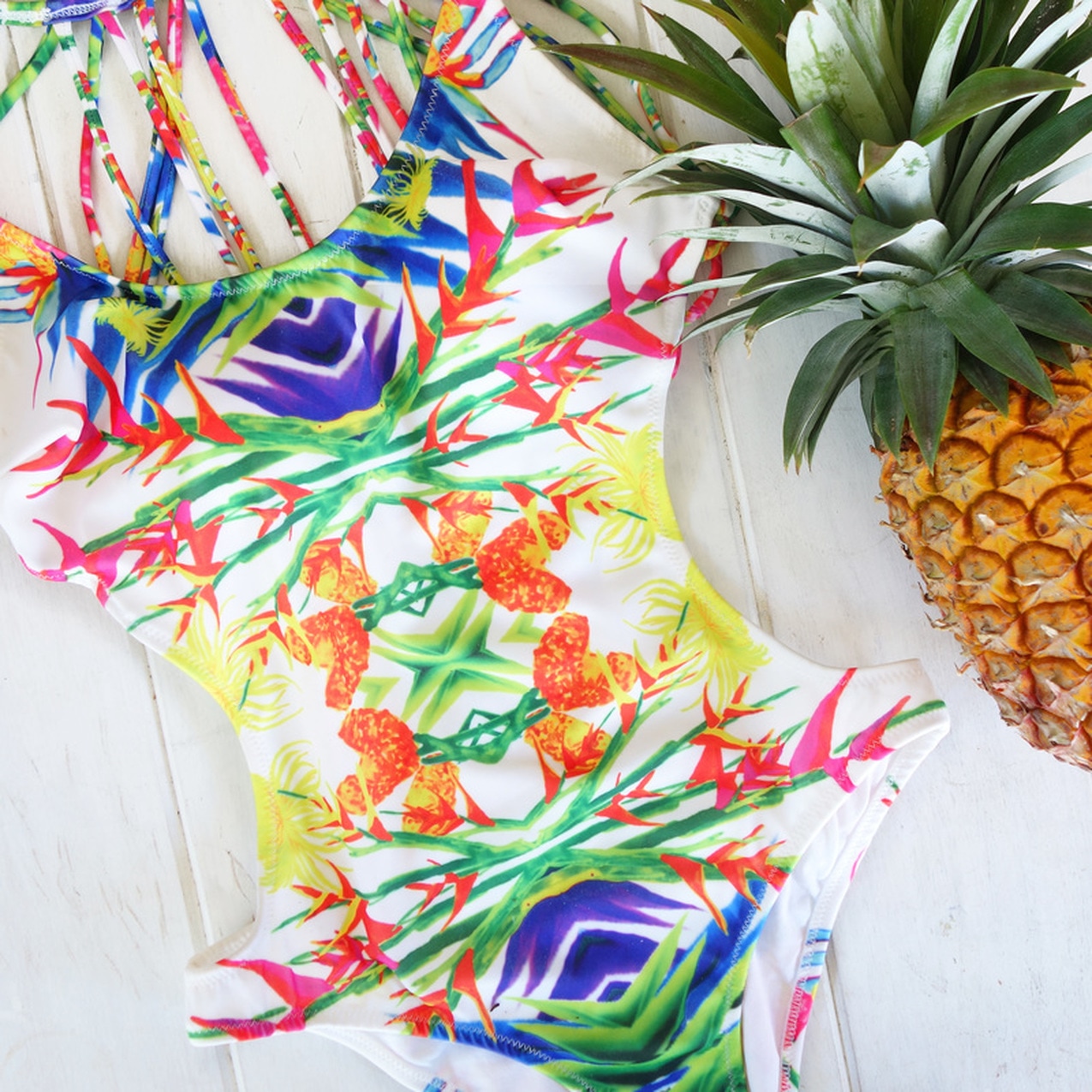
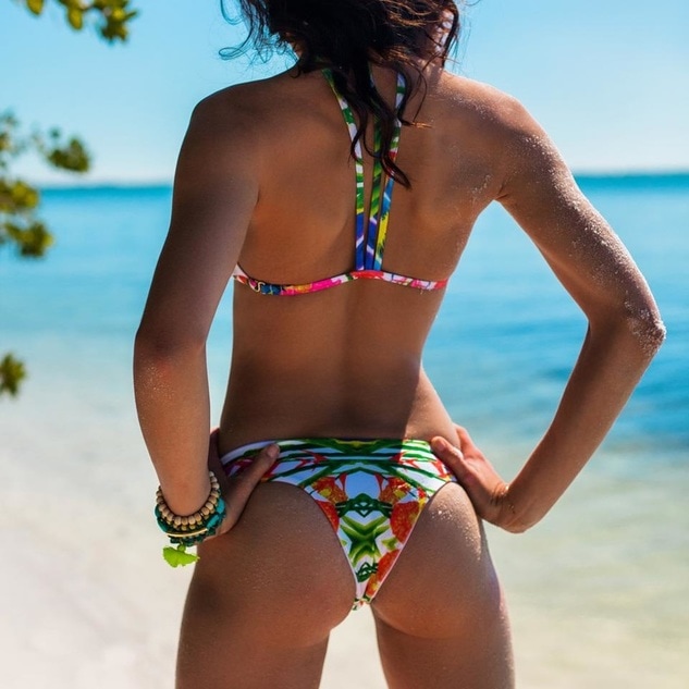
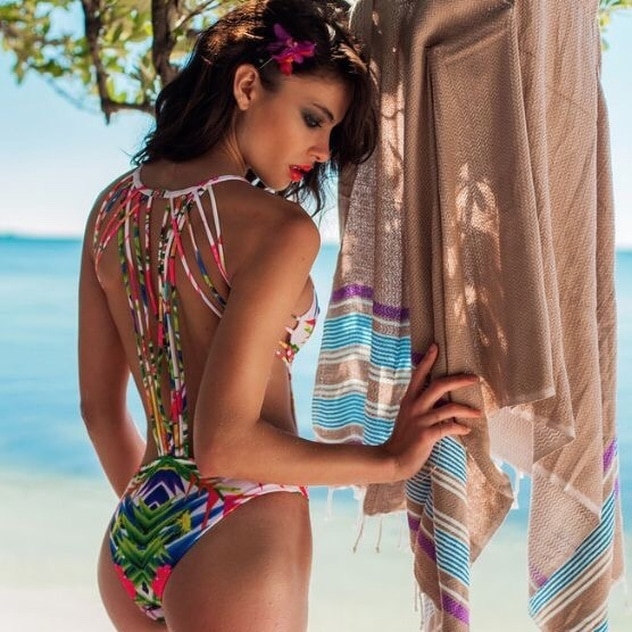
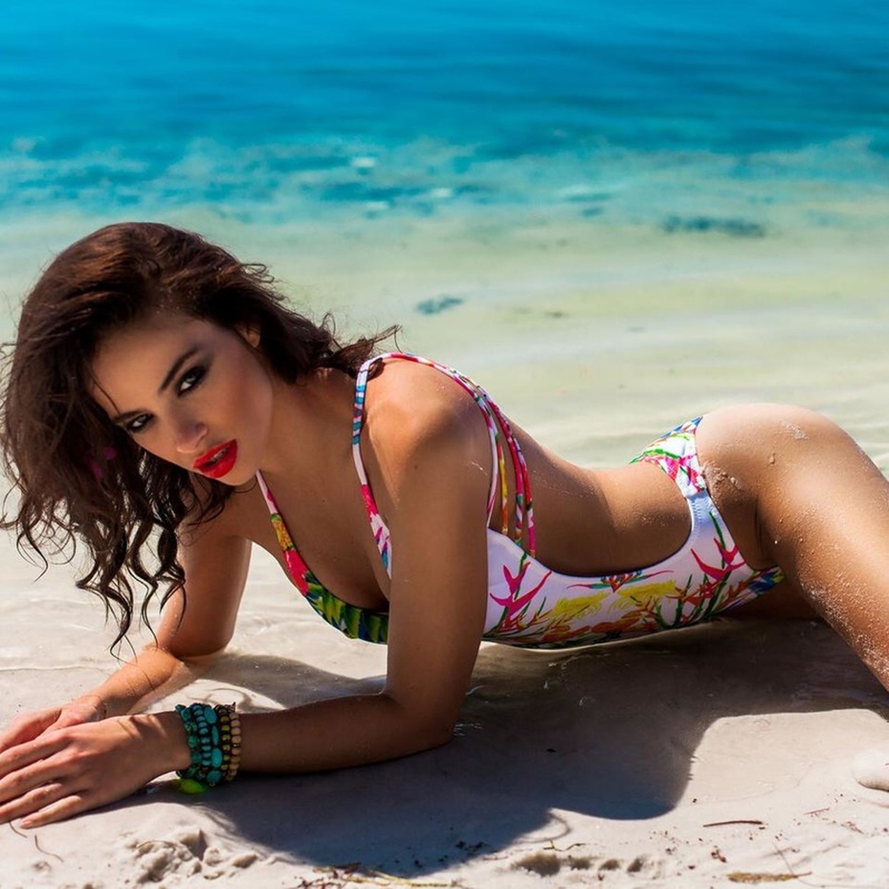
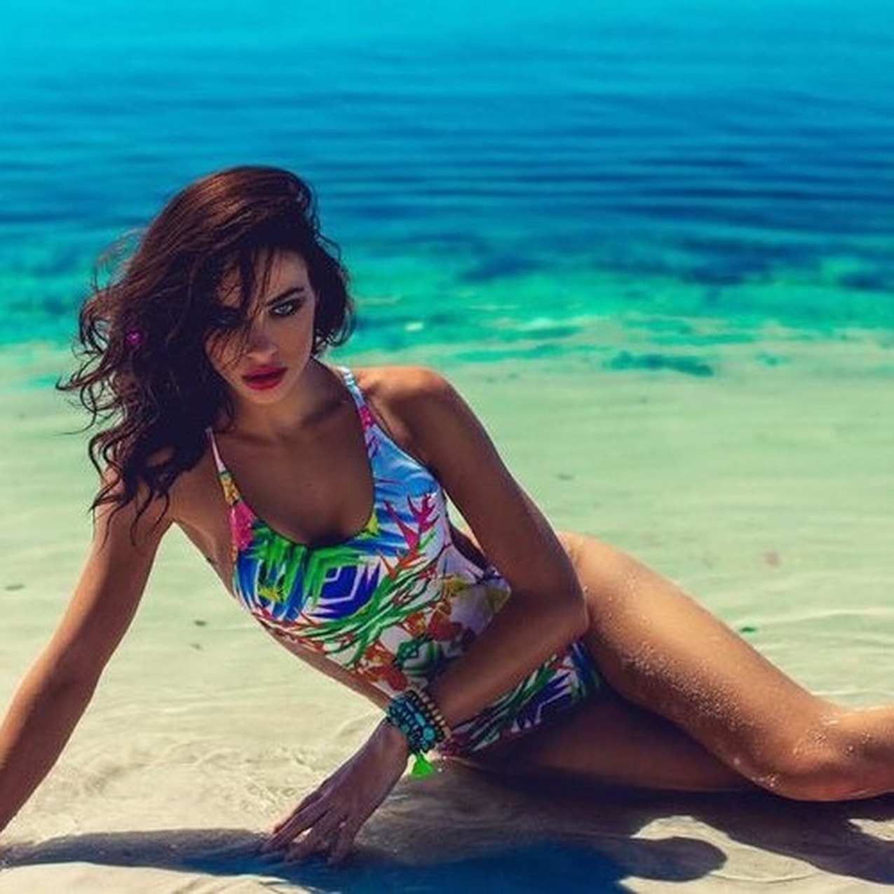
Stay tuned for more Bio Pak updates. Britt xxx 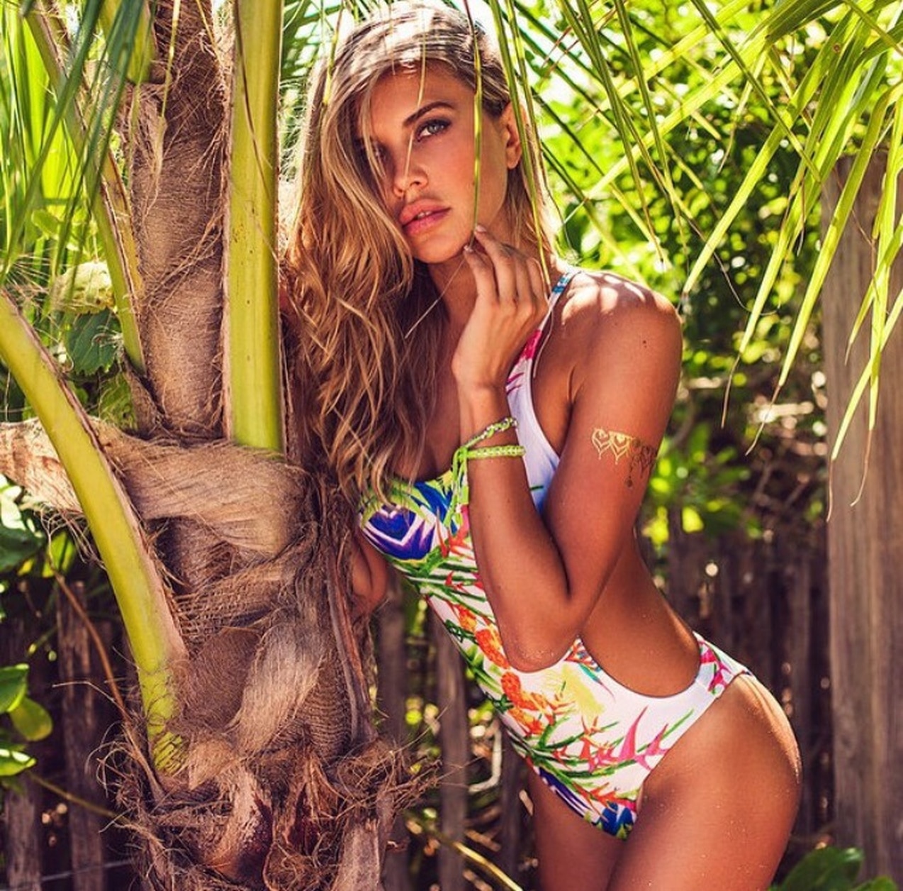 I recently collaborated with International Swimwear Label Plumeria Swimwear. Owner Gabrielle seemed professional and sweet. After a few emails it didn’t take us long to come up with a design style for her next collection.
I hand painted each flower and leaf to this print design individually, allowing me to place them creatively and as I chose. As you can see, the design (like most of my others) Is symmetrical. I think that is one of the things that makes this design even more special. As well as the print, I love the bikini design as it is different and makes the swimsuit even more unique. To view my Britt Laspina print for Plumeria Swimwear, or to view their other amazing products visit their website at: www.plumeriaswimwear.com/shop XX Britt
These pieces resonate with me deeply. They are my symbolic reminder, to experiment, not only with design styles, but with design mediums as well. It all started late one night after dinner and drinks, I returned home and decided to start creating. As you may have already noticed, they are not symmetrical, nor do they embody any qualities of my usual line work.
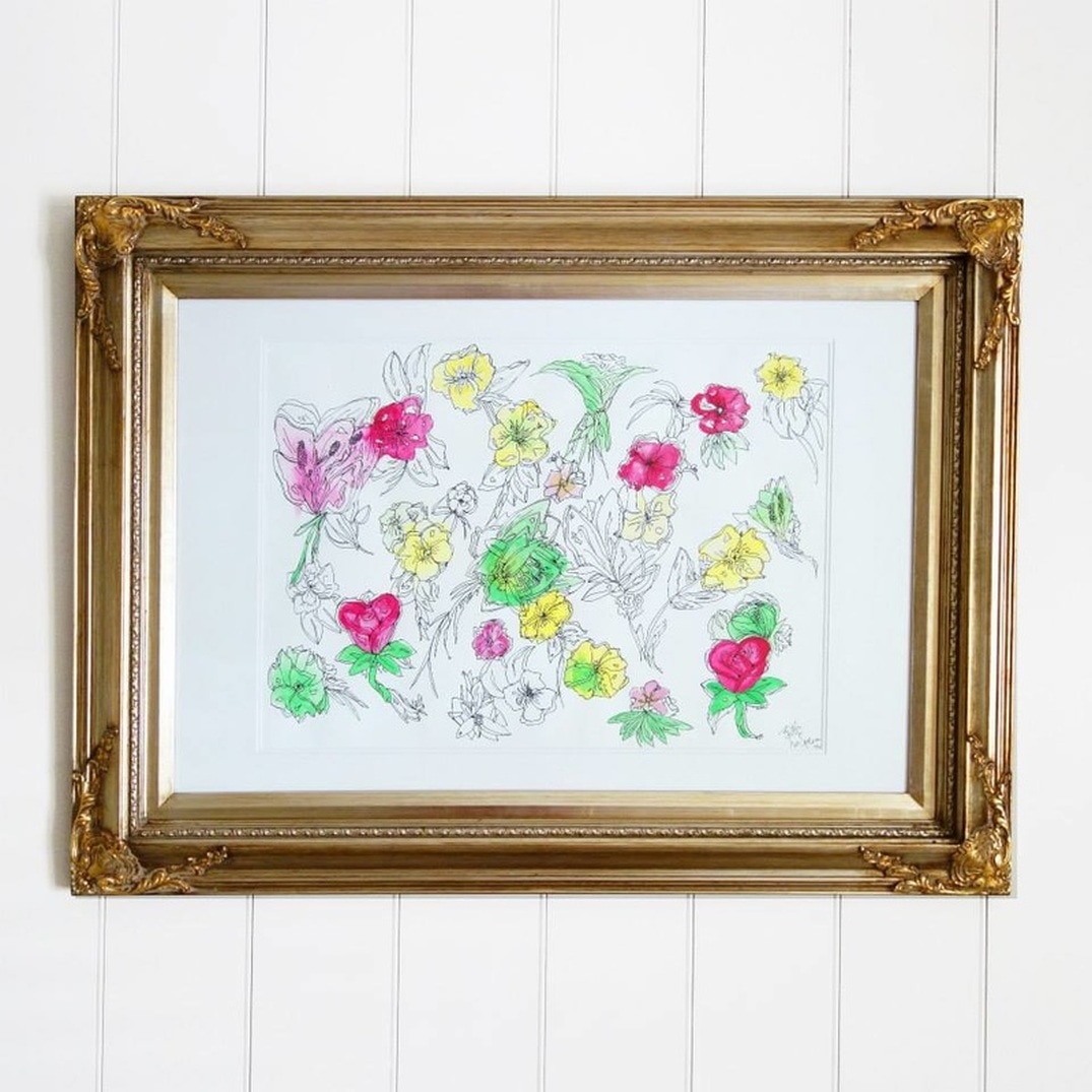
I assume that the differentiating qualities that the pieces hold, unlike other works of mine, are what makes them so unique to me. I really do love most things floral, including surrounding my workspace with fresh flowers from the Farmers Markets. I can't wait to create more pieces like these two, free flowing and easy on the eye.
Love Britt xx ROSE LEAF LOVE
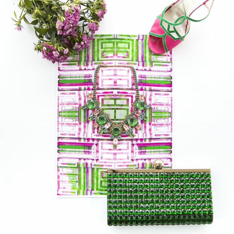
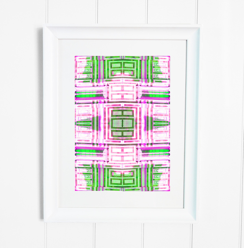
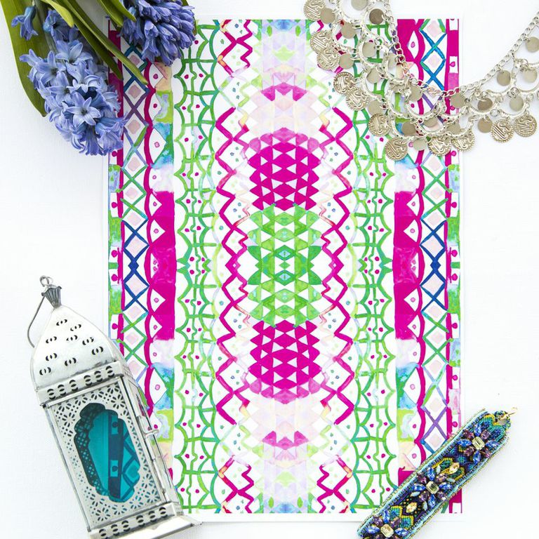
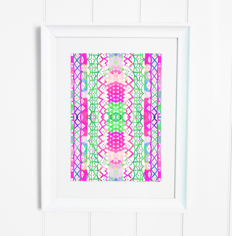
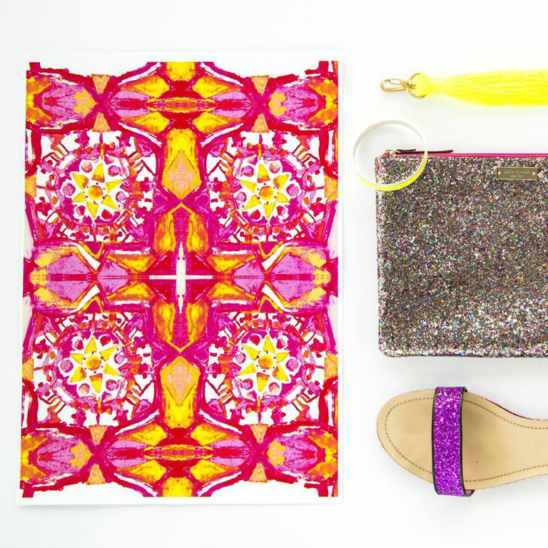
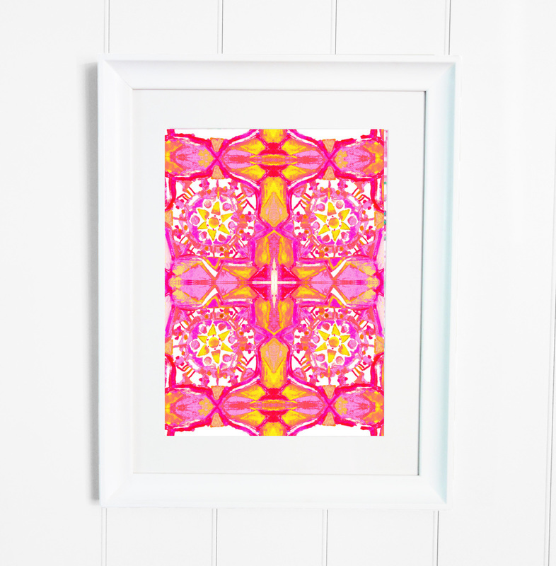
This print entitled Rose Leaf Love was inspired by all the pretty pastels I saw whilst in Morocco and the pattern from the side of a cathedral I saw in Florence. I am a big lover of symmetry, and the amount of line work in this image represents that. Flat Lay Credits: Prada Shoe, Kate Spade Clutch, Vinatge Necklace. PINK PALMS
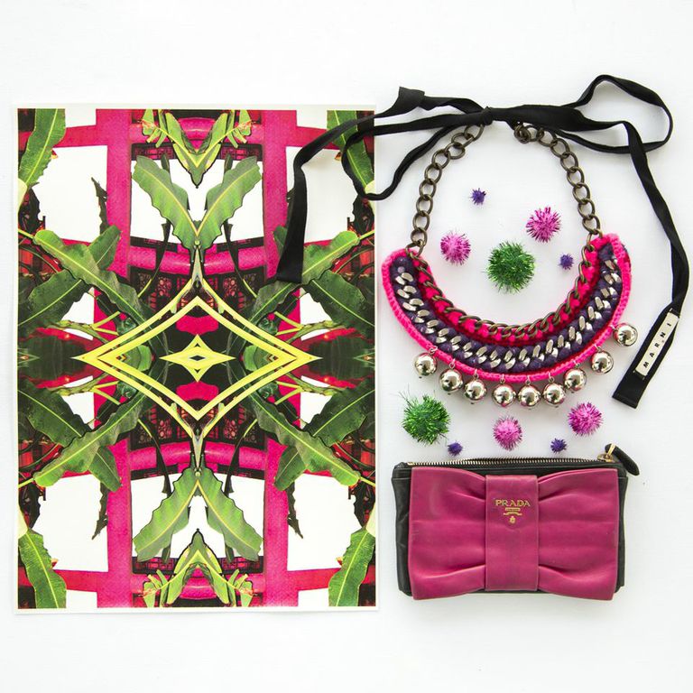
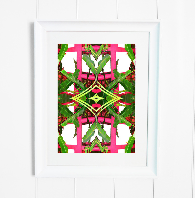
This mixed media print was originally a photograph taken over the balcony in my Riad while in Marrakech, Morocco. At the time, I had no idea why or what it was going to be; however what I did know is that it was going to be a special capture. The pink that you see was originally a burnt orange, which was the colour of the walls. Flat Lay Credits: Prada Clutch, Marni Necklace. MINT MOSAICS
This print is a subtle combination of watercolour line and shape work, hand painted it proves to be subtle yet chic. Mint Mosaics, a name again taken from my time in Morocco is represented in this print by it’s colours and design. I saw so many simple repeat patterns that I had to include one in this collection. SUNLIT SOUKS
Sunlit Souks is a watercolour print that represents the feeling I had when walking through the streets and souks in Marrakech. I wanted to show how warm it was through the blurred line effect you see within the watercolour detailing. Flat Lay Credits: Ralph Lauren Heel, YSL Clutch CITRUS CHARM
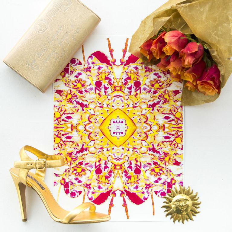
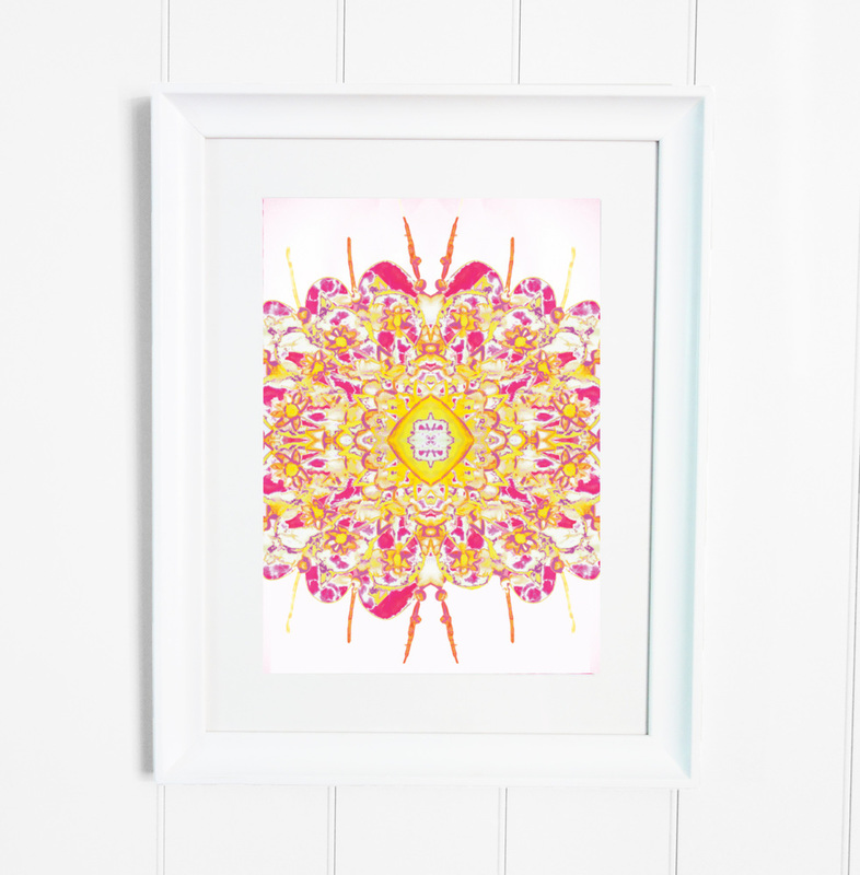
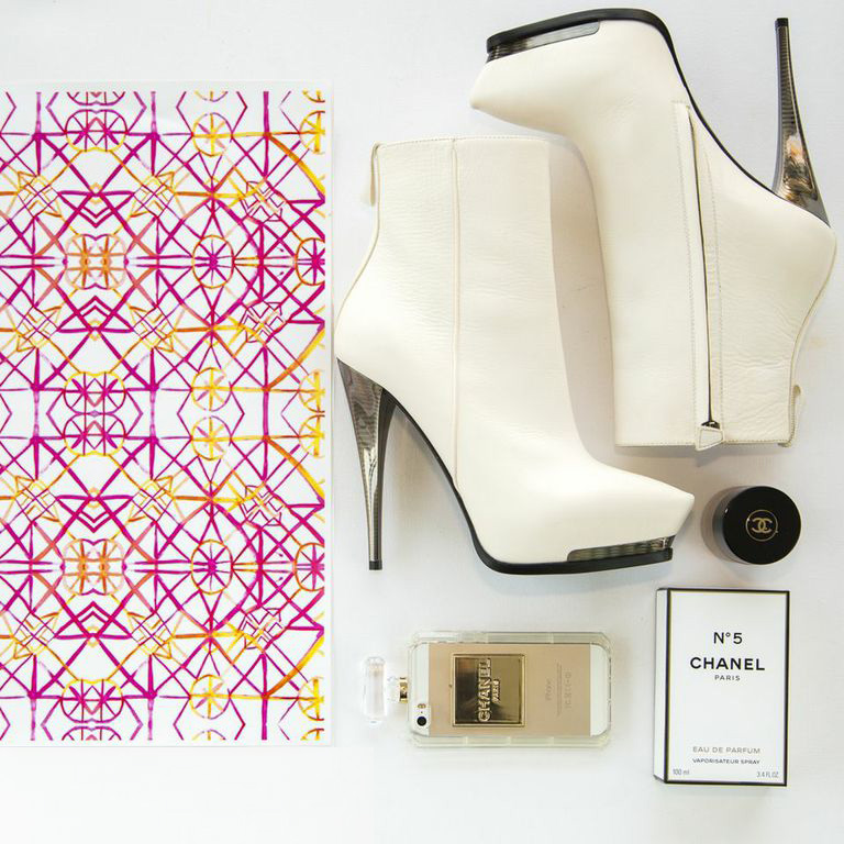
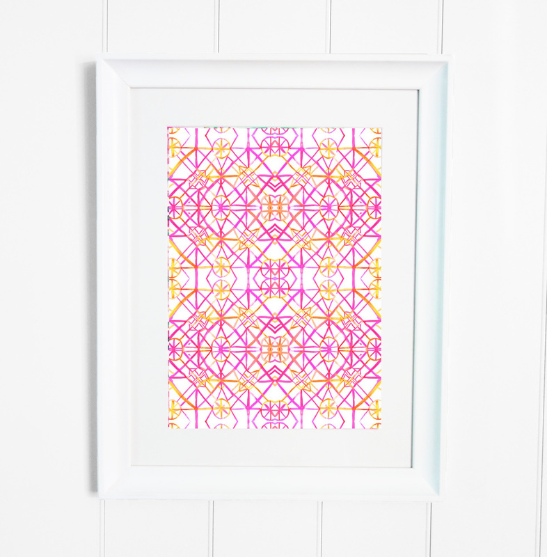
The name “Citrus Charm” came from the amount of zesty meals I had whilst in Marrakech, in combination with all of the snake charmers in the middle of the Medina. A lot of my work is made from a variety of mediums, wether it be water colours and ink pens or acrylic pants and oils.. so for me, I felt it only natural to combine two different influences into one name for this Watercolour Print. Flat Lay Credits: Kate Spade Clutch, Cat Hammill Bangle. RIAD RIOTS
The name Riad Riots comes from the level of absolute chaos in the streets I saw everyday. I thought this print was a great fit for that, while it is symmetrical, there is still a lot going on, and I think that is represented by the human eye not knowing where the main focus is found initially.
Flat Lay Credits: Lanvin Boots, Chanel Perfum and Make up. Britt xx 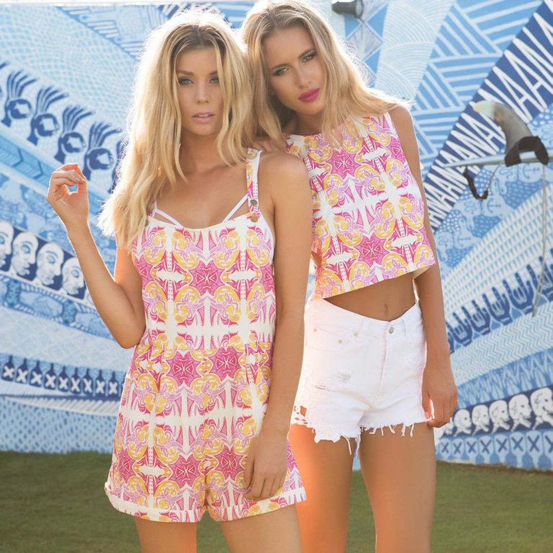 Pictured Above is one of the dozen prints I designed for Australian Label Sabo Skirt. This Britt Laspina print was originally hand painted, using three different watercolours.
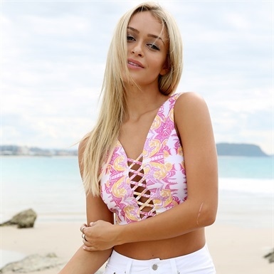
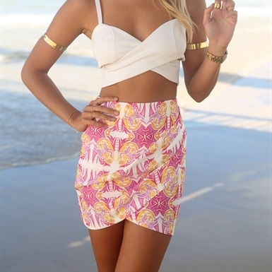
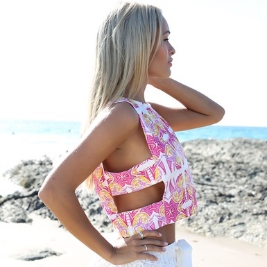
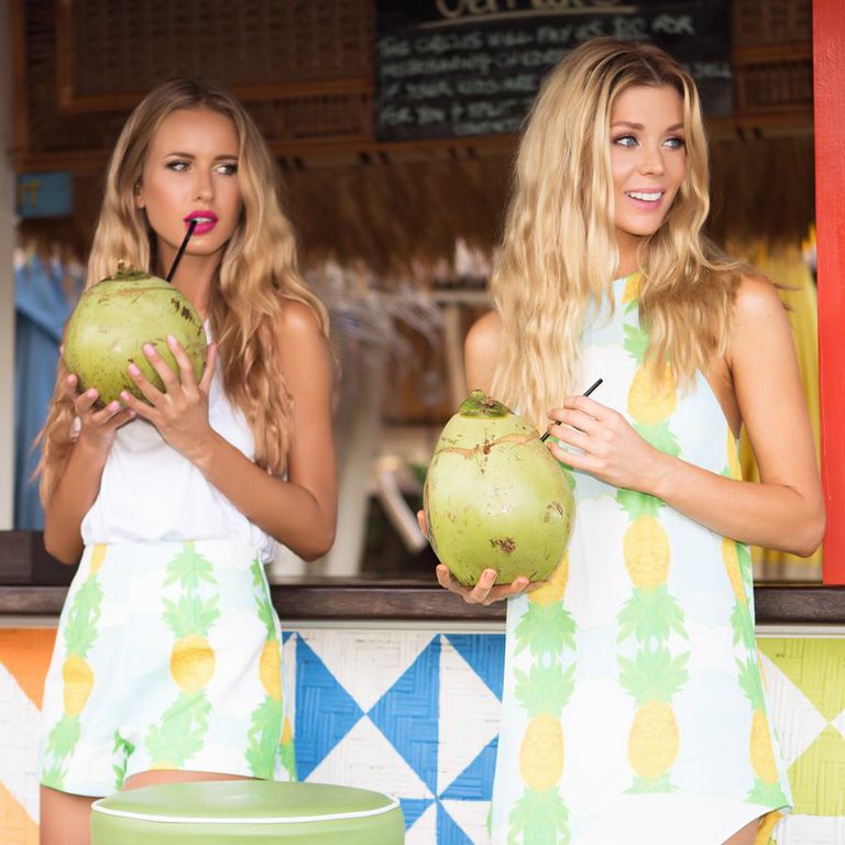
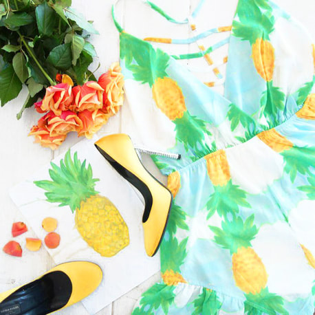
I remember the day I started painting this design, I was just playing around and not really expecting anything to come from it. Those are the projects that always turn out the best for me. Client Sabo Skirt managed to stretch the print out over a number of different styles and products. I later purchased many of these items off their website to feature in my samples collection. I learnt from this, that every collaboration is a learning experience. Britt xx After we returned from Europe I had some exciting projects to look forward to. This Pineapple print was one of the first Watercolour Paintings I ever did. I never imaged it being on Fabric, or even yet, being sold to a future client. A special original illustration it is, that turned out to appear in front of many more people than myself. Above Photos: Models Sheridyn fisher and Renee Somerfield wear the Pineapple Print for Client Sabo Skirt in Bali.
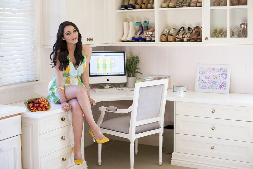
Above Photo: Wearing the Sabo Skirt Playsuit in my Studio, wearing Sonia Rykiel Heels. Taken by the talented Fashion Photographer Bonnie Cee.
Britt xx
This was one of my first Textile Collaborations, I couldn’t believe how excited I was to see the final product. I had drawn this Mandala Print sitting in my apartment in Milan, my family were watching a movie and I was feeling creative. I was so excited to use the pens that my Boyfriend Angus bought me in Switzerland, St Mortiz. I absolutley love love love how these photos turned out. Ruby Yaya has such amazing style, I would describe it as “Chic Bohemian” for the everyday woman. Ruby Yaya wholesale their clothing, so to shop this print view their stockists at http://www.rubyyaya.com/stockists/ Much Love, Britt xx 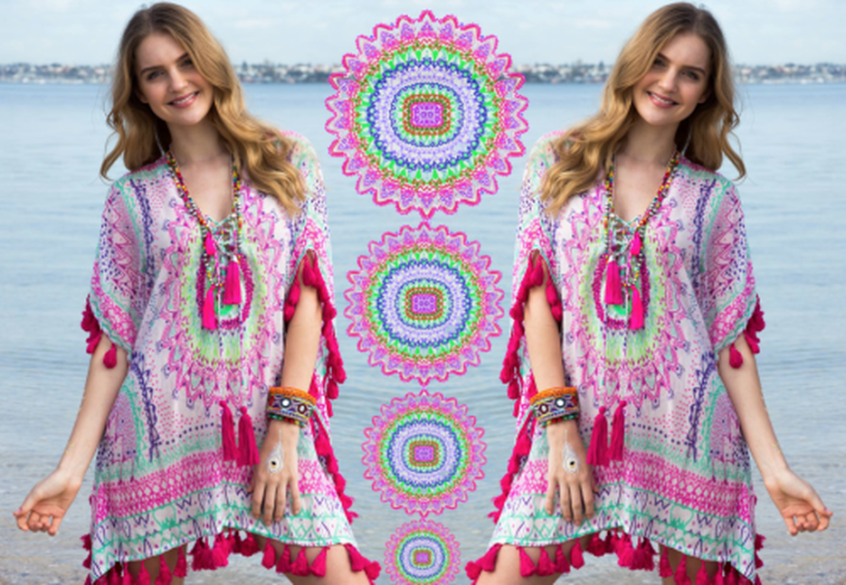 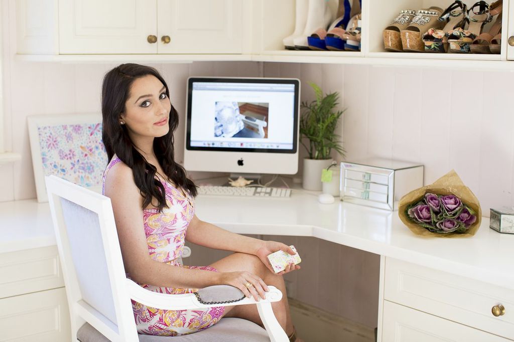  Hi everyone! Thank you for visiting and checking out my first post. I am creating this blog for all things happening in my life regarding DESIGN, TRAVEL, FASHION and LIFESTYLE!
I can’t wait to start sharing with you all! x |