|
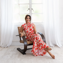
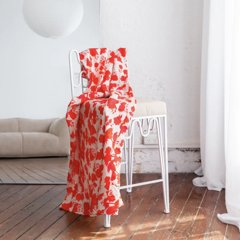
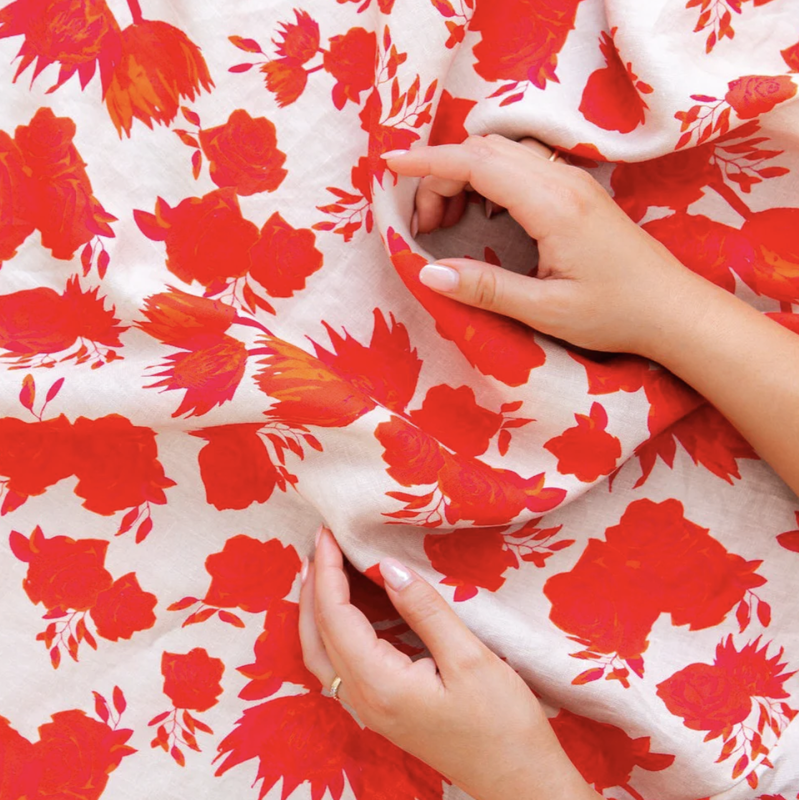
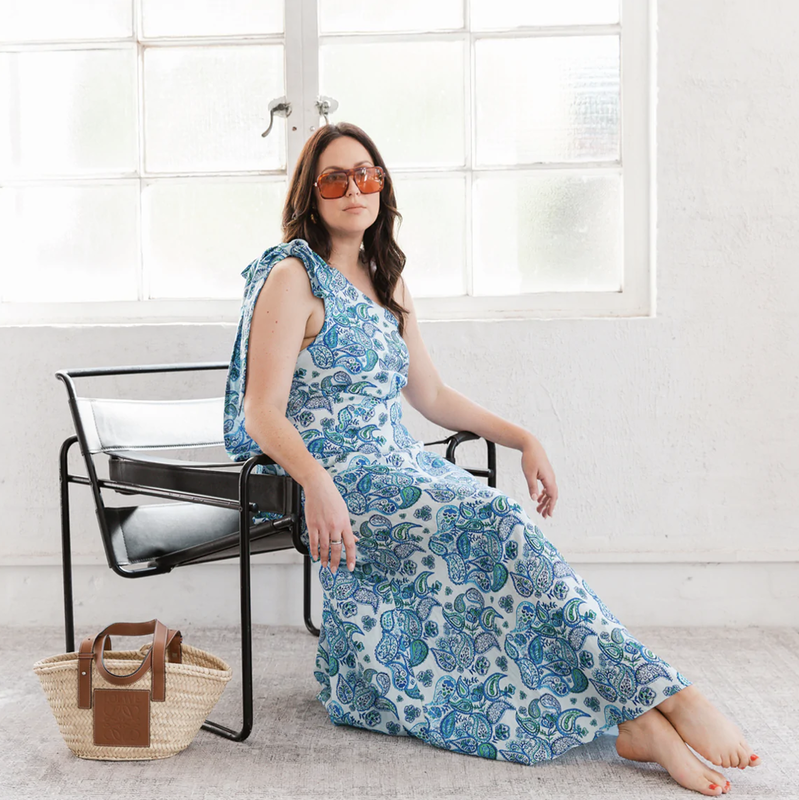
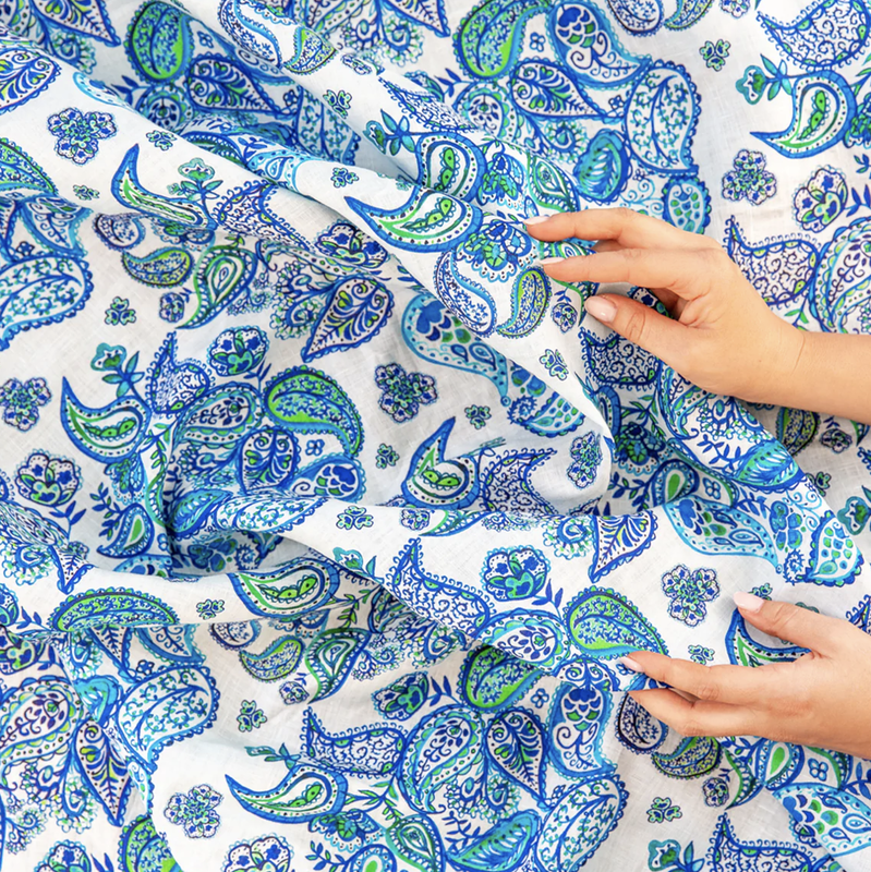
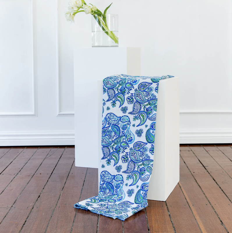
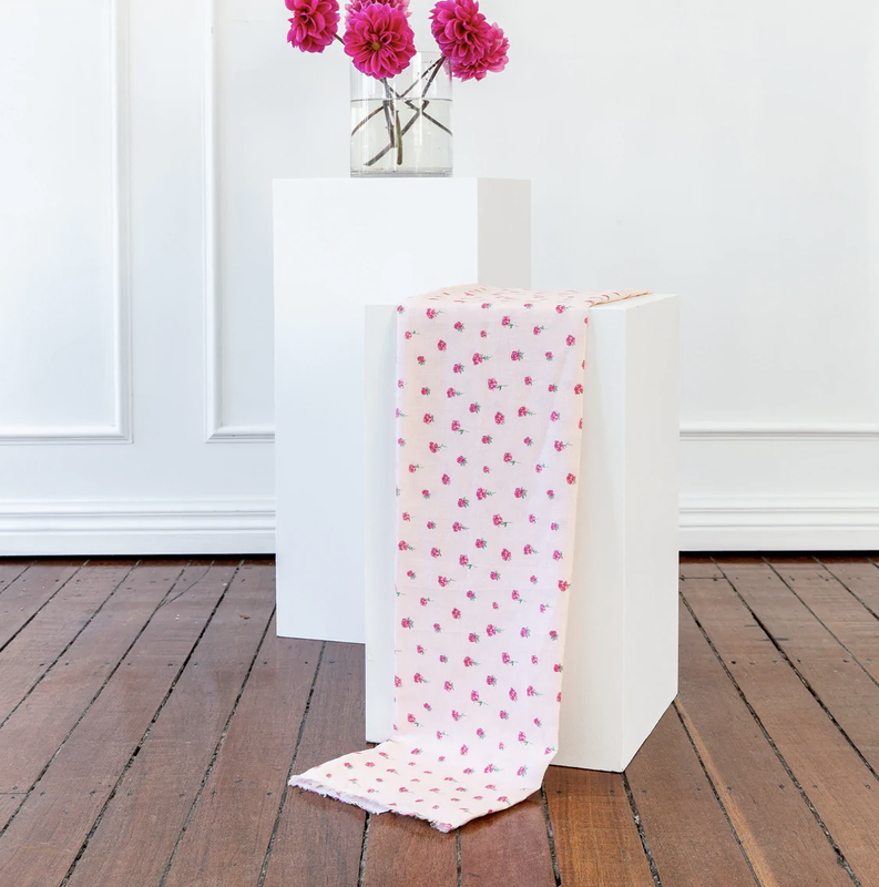
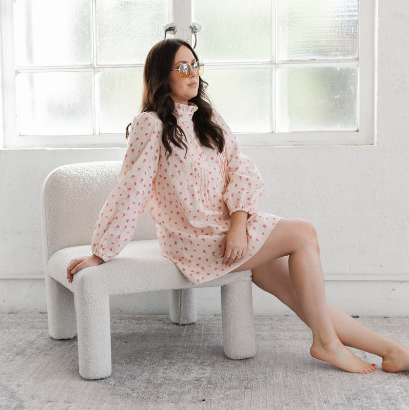
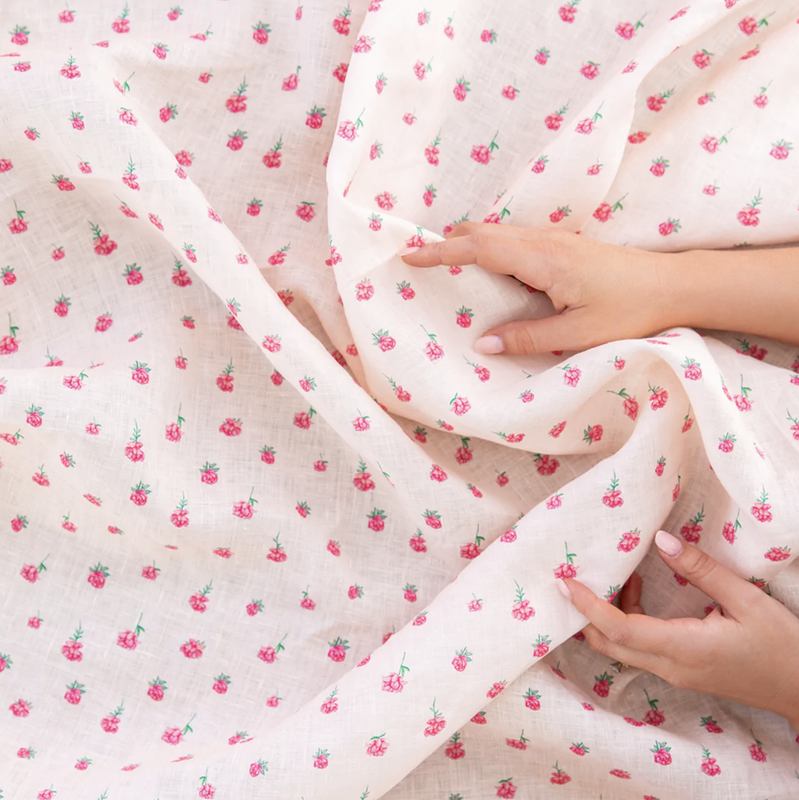
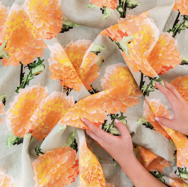
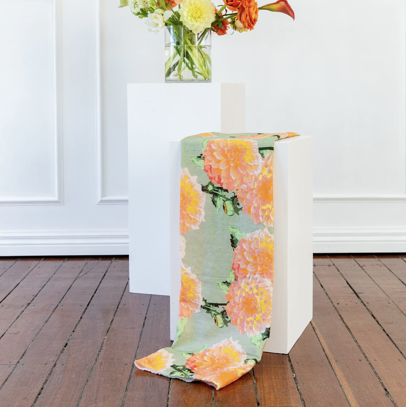
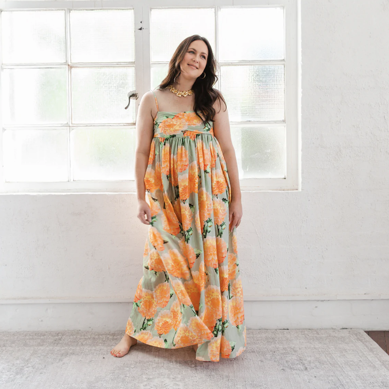
BRITT LASPINA x THE FABRIC BROKER It brings me joy to see designs I have created, that come so naturally to me, light up the lives of so many. So when The Fabric Broker (TFB), a business selling fabric by the metre to the public, contacted me to see if I would design prints for their new range, I was delighted to accept. Their vision for the prints commissioned are mostly bold, bright and daring. That is one of the many reasons why I was so excited to accept this project. So many brands won't invest money in crazy patterns, because the more out there they are, the more risk there is. Each print designed for TFB is FUN for both the customer who decides to purchase fabric to create their next piece and also for me to create! It is safe to say that working on this project has kept me busy, the fact TFB kept coming back for prints is a testament to their happiness and positive experience working with me. Which is the best feeling of all. Below I will step you through each print and explain the process behind them! Unlike other designs sold by the brand, every print I designed for TFB Sold Out. BIG RED This print was created entirely digitally, on adobe illustrator. I hand drew each motifs, ensuring there would be enough depth to add a few tonal shades. The vision of the print was to create a hand blocked look, not knowing where the design started and ended. This is the beauty of a seamless repeat! I chose a medium shade of oatmeal for the background colour after looking through my Pantone books. The people LOVED this print.. You can see some of the comments here, alongside nearly 4k organic reach likes. POPPING PAISLEY As you might be able to tell, this print was hand painted with watercolours. I assembled the motifs in Adobe Photoshop, filling in each paisley cluster with little motifs to embrace the negative space. TFB sent me plain navy paisley inspiration, though I wanted to give this print a real watercolour feature, so I mixed in some bright greens to really make it pop! You can watch the process reel here! COMING UP ROSES This is such a classic and soft print and was a joy to create. I hand painted each floral motif with watercolours and assembled in Adobe Photoshop, ensuring the scale of each motif was evenly distributed. To finish, I selected the perfect soft pink from my Pantone books! DELILAH This print is unlike anything I have ever designed before... from the colours to the concept. It is really unusual and I just love it. I designed this single, highly detailed motif on Adobe Illustrator. What makes it so great and life like is the way I have shaded the petals, ensuring they deliver that dimensional appeal while still being able to be screen printed if needed. You can view the process reel here. Stay tuned. There are three more prints to come soon...
|
A little about meWelcome to posts from my journal. I am a Textile Artist from Australia who loves the very tasteful use of colour and print!
I plan to write content here that is meaningful to me and compliments my lifestyle of mindful, passionate living. I look forward to sharing many of my thoughts with you all. |

